20 November 2018
No video selected
Select a video type in the sidebar.
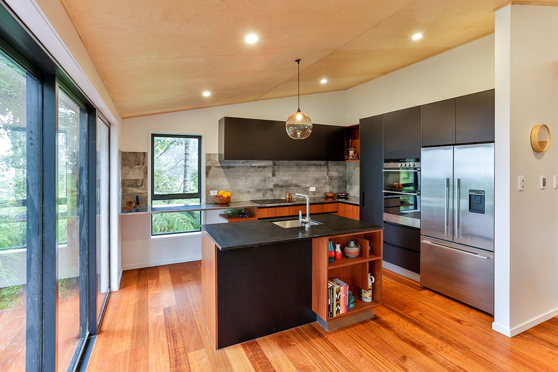
A client’s love of mid-century design determined the look and feel of this modern family kitchen, located in a beautiful bush setting.
20 November 2018
When Petra Brebner’s clients told her they wanted to have both colour and wood in their new kitchen, she was a little concerned, because the space in which the kitchen was located already had a native hardwood floor and plywood ceiling. “My first thoughts were, this is going to look too heavy,” she feared.
Knowing they both liked mid-century design, Petra – Kitchen Designer at Mastercraft Kitchens New Lynn, asked the husband if he liked Herman Miller? And his eyes just lit up, says Petra. “That’s when I suggested not to use colour, but just use black, along with the quarter-cut, Sapele wood grain they had mentioned they liked.”
“Sapele has a distinctive grain that can look quite an old-fashioned if you’re not too careful,” explains Petra. But she goes onto to say it can also look stunning. Just think about the distinctive grain used on the classic Eames chair. And that’s the look the designer was going for when she steered her clients away from colour.
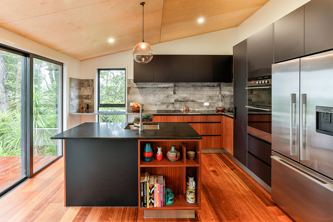
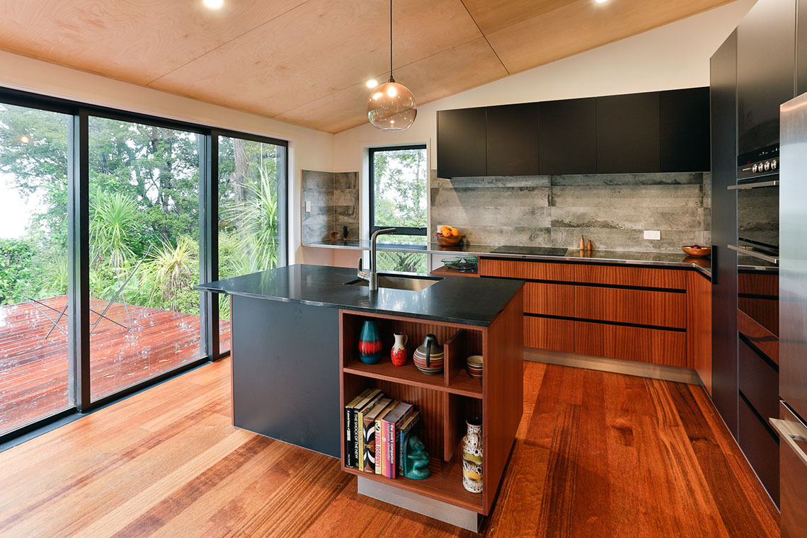
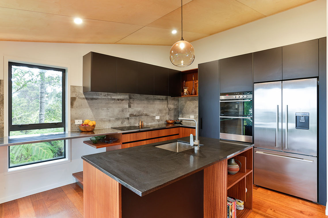
From here, the design evolved, with the wood being used as the hero against the black background. “My client told me what she had in mind in terms of volume and layout, and I just cleaned that idea up and made it work in the space, layering in the two materials.”
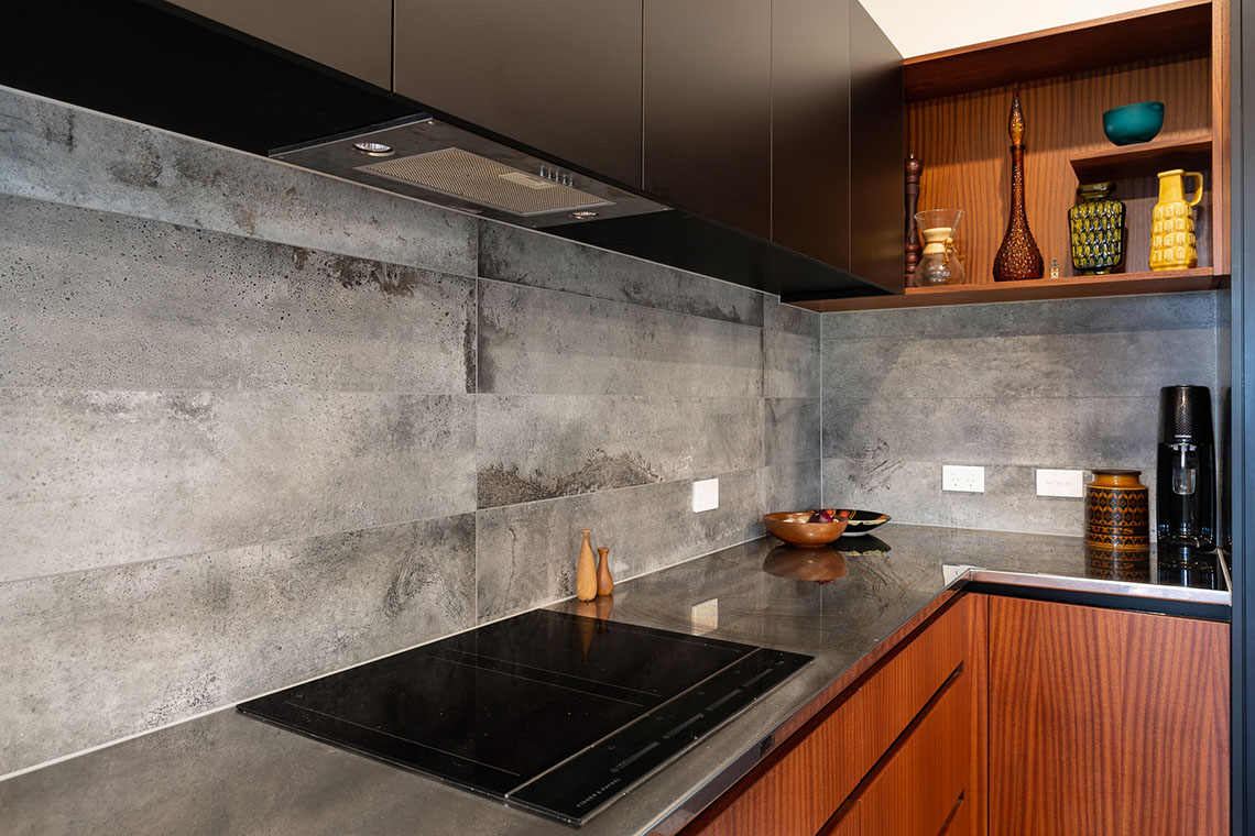
One specific request was for open shelving to display her client’s collection of retro ceramics. “I didn’t want to just give them plain shelving, so I introduced subtle details into the design, like finishing the vertical dividers short of the top and bottom of the unit, and only having shelving that goes part way across the open space. The shelving brings a furniture look into the kitchen that softens the space,” she adds.
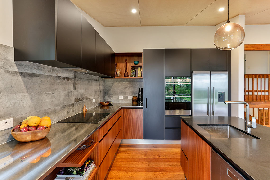
The other quirky piece of design Petra introduced is the stainless steel workbench that runs the length of the back wall, slicing straight across a tall picture window. “My client works from home, so wanted an office area within the kitchen and were prepared to sacrifice some storage space to achieve this. So that’s the purpose of this part of the kitchen.”
“The concrete-look tiles used for the splashback were my client’s choice,” says the designer. “I advised her to keep it neutral and not add another colour that would compete with the simple material palette of the timber grain, stainless steel and black. Her choice works well, because there’s a bit of everything in there.”
Aware that the open-plan room in which the kitchen sits is all about the beautiful bush views, Petra tucked the tall appliance towers and storage unit behind a nib wall, so that they are not the first thing that are seen when you enter the kitchen.
Overall, Petra’s design successfully respects the original aesthetic of home, and at the same time brings it up to date, creating a balance between giving her clients what they wanted in terms of a retro look and giving them a fresh, modern kitchen.
“In many ways, it’s now a timeless kitchen,” she says. “I certainly had a lot of fun with it, and my clients were open to my suggestions and really easy to work with. The end product is really great, and they really love it.”
For more inspiration order a copy of our Look Book. To order your FREE copy go here.
This kitchen was proudly designed, manufactured and installed locally by Mastercraft Kitchens New Lynn.


Quick Links
©2024 Mastercraft Services NZ Limited | Privacy Policy | Website Terms of Use