30 September 2022
No video selected
Select a video type in the sidebar.
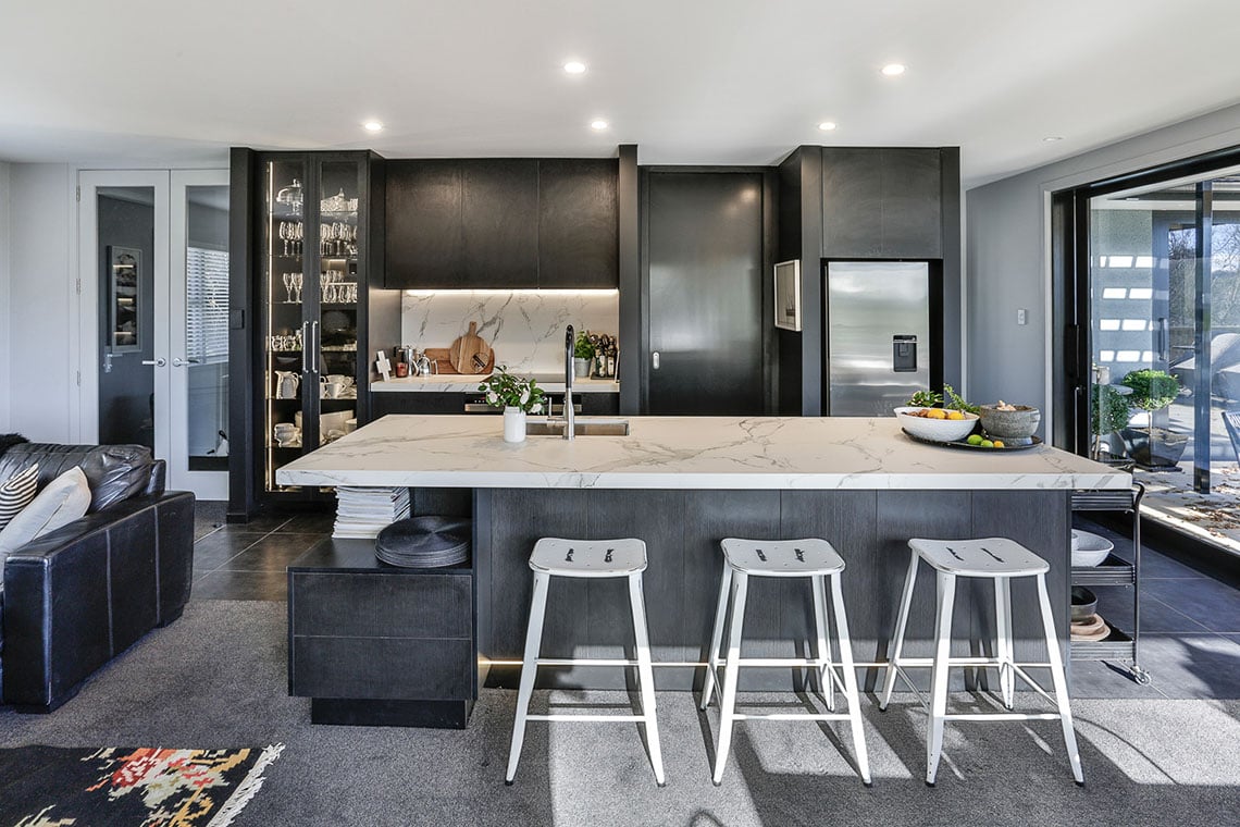
This complete renovation delivers a bold, monochromatic kitchen, softened with subtle natural touches in the details.
30 September 2022
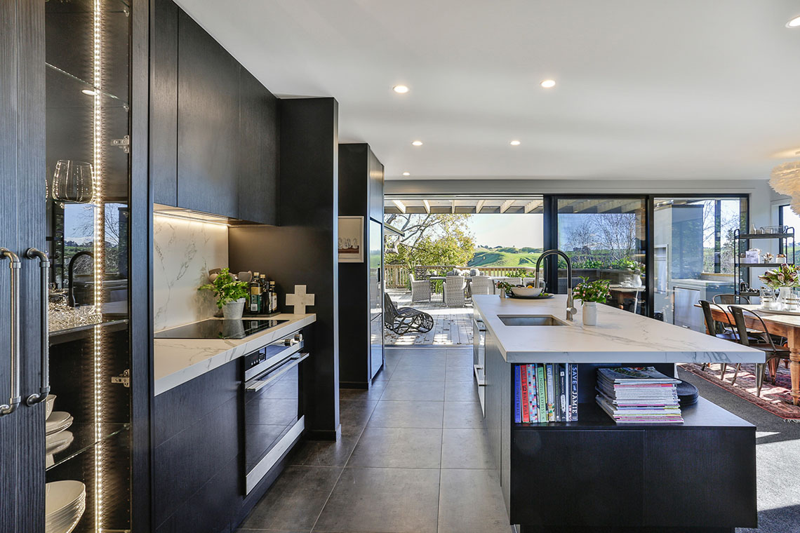
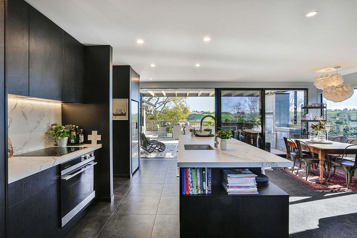
It’s a brave decision to make. Black can be an unforgiving colour, especially for a kitchen, but homeowner Nola Todd was very clear in her vision when she engaged Michael Mancer from Mastercraft Kitchens Whanganui to design her new kitchen.
“This was the third kitchen I’d done for Nola. She’s a great client, but she is very particular what she wants,” says Michael. “In this case, she said from the start that she wanted a black kitchen… and definitely no handles.” Michael goes onto say that there was also a request for a large, functional kitchen island, and also a small scullery that could be closed off, away from prying eyes, plus a display cabinet to showcase glassware and crockery.
“I wanted a classic, elegant and timeless look,” says Nola. “And right from the outset, I knew I wanted it to be black – but not a plain black that would highlight all my little grandies’ fingerprints.”
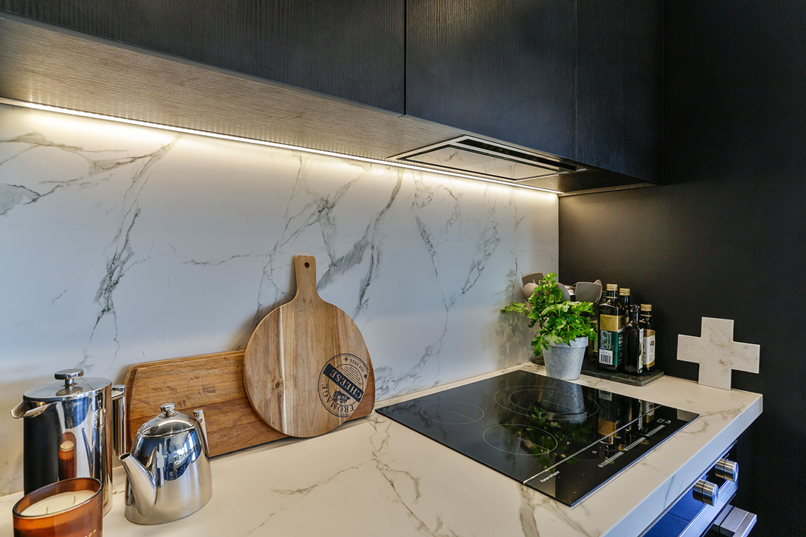
To combat the fingerprint problem, the designer opted for a woodgrain Melamine, in Black Wilderness, for all the cabinetry. Not only did this give his client the colour and finish she requested, it also gives the completed kitchen a lot more depth and visual interest than using a plain, painted finish. The four protruding spine walls that break up the kitchen’s back wall were also painted black, in Resene Nero, to help them blend into the new colour scheme.
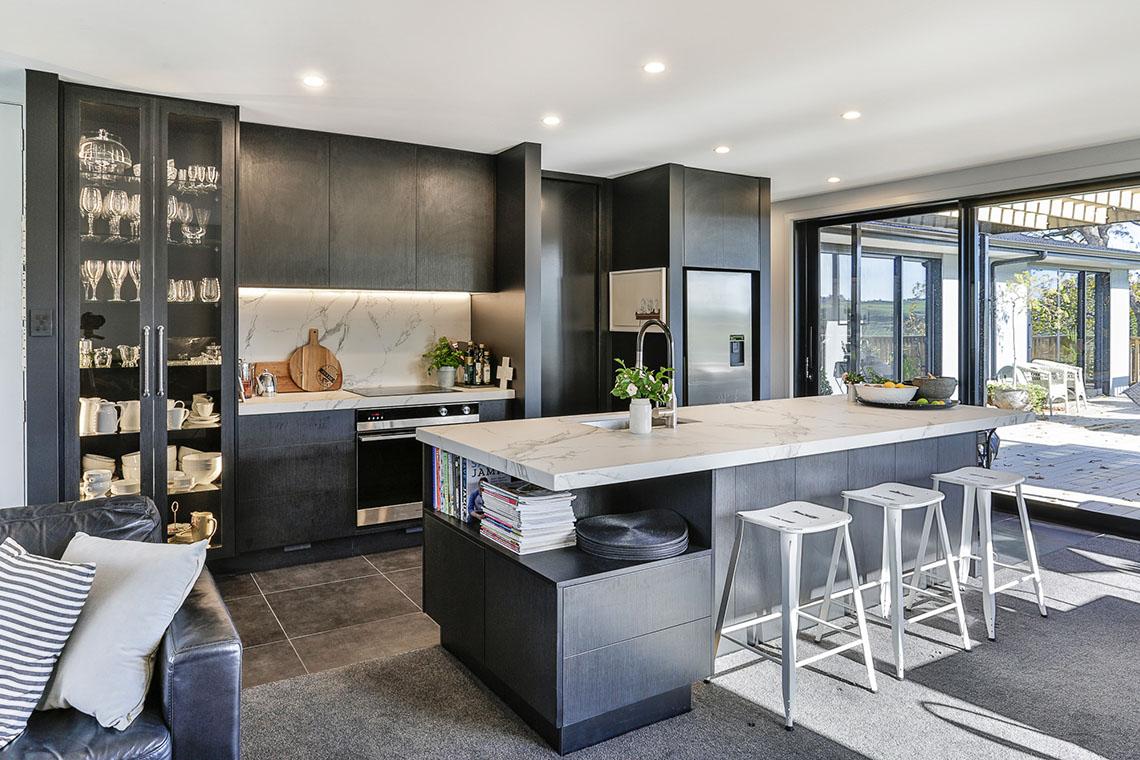
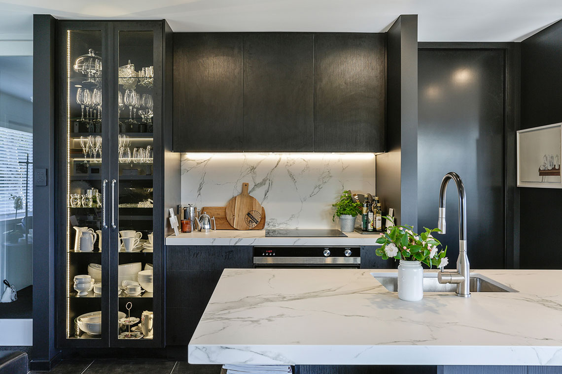
The marble-look benchtop is made from Dekton – a highly durable and impermeable material, made from compressed porcelain. The designer chose the same material for the benchtop and the splashback behind the cooktop to unify the two spaces. The dark veining of the ‘Aura Natural’ pattern gives a natural, organic look, and matches the black of the cabinetry perfectly.
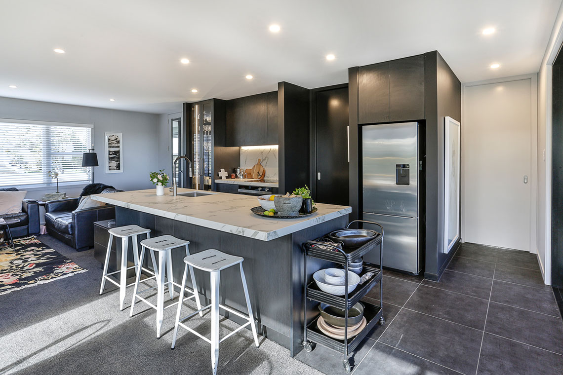
“There’s a lot of storage and functionality built in below the island benchtop,” says the designer. “On the kitchen side there are a set of wide, load-bearing drawers for plates and pots, a double dishdrawer, plus a pull-out bin. On the living room side, there are a series of push-catch cupboards, plus a custom shelving/drawer unit that helps connect the kitchen to the rest of the open-plan living area.”
More storage can be found in the small, but thoughtfully laid out scullery located behind a space-saving sliding door next to the fridge. “Most of the storage in this area is open shelving, which gives easy access and is a lot cheaper than installing drawers and cupboards,” he says.
Michael says that the tall, glass-fronted display cabinet on the back wall took a while for him to get his head around – specifically how it would fit in with the rest of the design.
“It actually worked out to be pretty cool in the end, but it took us a wee while to work out because Nola didn’t want it to look like it was part of the rest of the kitchen,” he explains. “To give it some difference, we used a pair of distinctive handles on the glass-fronted doors. We also lit the space with LED strip lights and used glass shelving to allow the light to spread through the whole cabinet.”
Nola says that Michael was very sympathetic and proactive to the evolving design, and she’s delighted with the result. “It’s fabulous, and I love working in it,” she says.
This kitchen was proudly designed, manufactured and installed locally by Mastercraft Kitchens Whanganui.


Quick Links
©2024 Mastercraft Services NZ Limited | Privacy Policy | Website Terms of Use